How to plot graphs right in psql on macOS (iTerm2)
If you, like me, work with Postgres mostly in psql, you might want to be able to plot a simple graph not leaving psql.
The recipe below was originally described by Alexander Korotkov, I slightly adjusted it to work with Python3. The recipe works thanks to iTerm2's Inline Images Protocol. For Linux, there are various ways to achieve similar results (see, for example, How do I make my terminal display graphical pictures?).
-
Get the plotting script and install matplotlib:
wget \
  -O ~/pg_graph.py \
  https://gist.githubusercontent.com/NikolayS/d5f1af808f7275dc1491c37fb1e2dd11/raw/4f19a23222a6f7cf66eead3cae9617dd39bf07a5/pg_graph

pip install matplotlib -
Define a macro in ~/.psqlrc (this line should work in bash, zsh, and csh):
printf "%s %s %s %s %s %s\n" \\set graph \'\\\\g \|
python3 $(pwd)/pg_graph.py\' \
>> ~/.psqlrc -
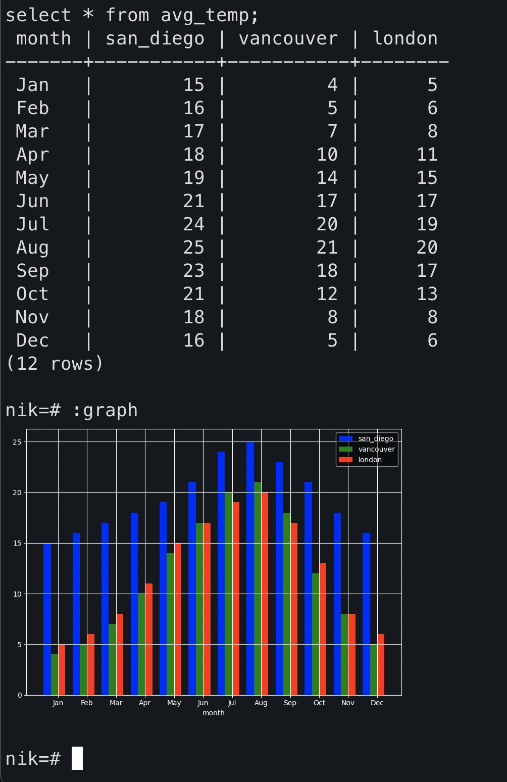
Start psql and try it out
nik=# with avg_temp(month, san_diego, vancouver, london) as (
    values
      ('Jan', 15, 4, 5),
      ('Feb', 16, 5, 6),
      ('Mar', 17, 7, 8),
      ('Apr', 18, 10, 11),
      ('May', 19, 14, 15),
      ('Jun', 21, 17, 17),
      ('Jul', 24, 20, 19),
      ('Aug', 25, 21, 20),
      ('Sep', 23, 18, 17),
      ('Oct', 21, 12, 13),
      ('Nov', 18, 8, 8),
      ('Dec', 16, 5, 6)
  )
  select * from avg_temp;

 month | san_diego | vancouver | london
-------+-----------+-----------+--------
 Jan   |        15 |         4 |      5
 Feb   |        16 |         5 |      6
 Mar   |        17 |         7 |      8
 Apr   |        18 |        10 |     11
 May   |        19 |        14 |     15
 Jun   |        21 |        17 |     17
 Jul   |        24 |        20 |     19
 Aug   |        25 |        21 |     20
 Sep   |        23 |        18 |     17
 Oct   |        21 |        12 |     13
 Nov   |        18 |         8 |      8
 Dec   |        16 |         5 |      6
(12 rows)

nik=# :graph
Result: